Uptime is a Poor Metric
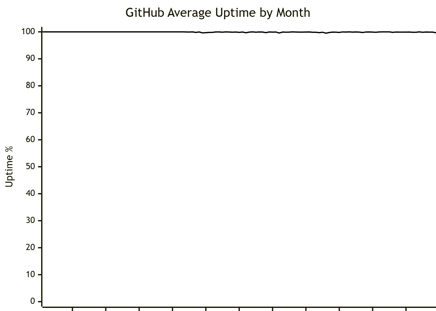
A colleague recently shared "GitHub's Historic Uptime", which is a visualization designed in a way that highlights the significant increase in instability with GitHub's services since Microsoft's acquisition in late 2018.
At first glance the contrast is glaring, but on closer inspection one might notice that the y-axis starts at 99.5%. Adjusting the graph to show the entire range from 0-100% would make the graph appear flat.
Does that mean that I think the Microsoft acquisition wasn't a significant impact on GitHub's services?
No.
I'm reminded of an apocryphal story of two smart students comparing their grades. The first received a grade of 99, and the second a grade of 100.
The first says to the second
One point difference isn't that big a deal.
to which the second replies
You got a 99 because that's the most you could get. I got 100 because that's all I could get.
Returning to uptime, it's hard to overstate how significant a difference there is between no problems and almost no problems.
When discussing high availability, it's common to hear measurements in numbers of nines.
| Nines | Uptime |
|---|---|
| 2 | 99% |
| 3 | 99.9% |
| 4 | 99.99% |
| 5 | 99.999% |
Each nine generally represents an order of magnitude of more effort.
Visually, they're practically indistinguishable.
This brings me back around to my primary topic and the title of this post, uptime is a poor metric. In my opinion, uptime expressed as a percent is just about the worst way to represent this data.
At this point you should be asking
So what do you think is a better way to represent uptime data?
I'm so glad you asked.
Before I give my answer, let's take a look at everyone's favorite subject: math.
We have three co-dependent values:
- Uptime
- Downtime
- Total Time
Uptime can be expressed as a percent which is really just a ratio of uptime to total time.
Downtime can similarly be expressed as a percent.
With a bit of massaging we can show the relationship between Uptime% and Downtime%:
Uptime% and Downtime% are unitless measures, as the units cancel. Both are relative to the total time.
What if, instead we look at the ratio of uptime to downtime? For brevity I will call this the "Uptime Ratio".
We can massage the equation a bit to express Uptime Ratio as a function of Uptime%:
Like Uptime%, Uptime Ratio is a unitless value, but instead of representing the portion of the time that a service is up out of the total time, it represents an average of how many units of time a service is up for every unit of time a service is down.
With an Uptime Ratio of 1, you'd expect the service to be down for every minute it's up (which is not a very good service).
Looking at Uptime Ratios for the "nines", an interesting pattern emerges:
| Nines | Uptime | Uptime Ratio (approx) |
|---|---|---|
| 2 | 99% | 99 |
| 3 | 99.9% | 999 |
| 4 | 99.99% | 9999 |
| 5 | 99.999% | 99999 |
Unfortunately, graphing uptime ratios runs into an issue at 100% uptime because the ratio becomes infinity.
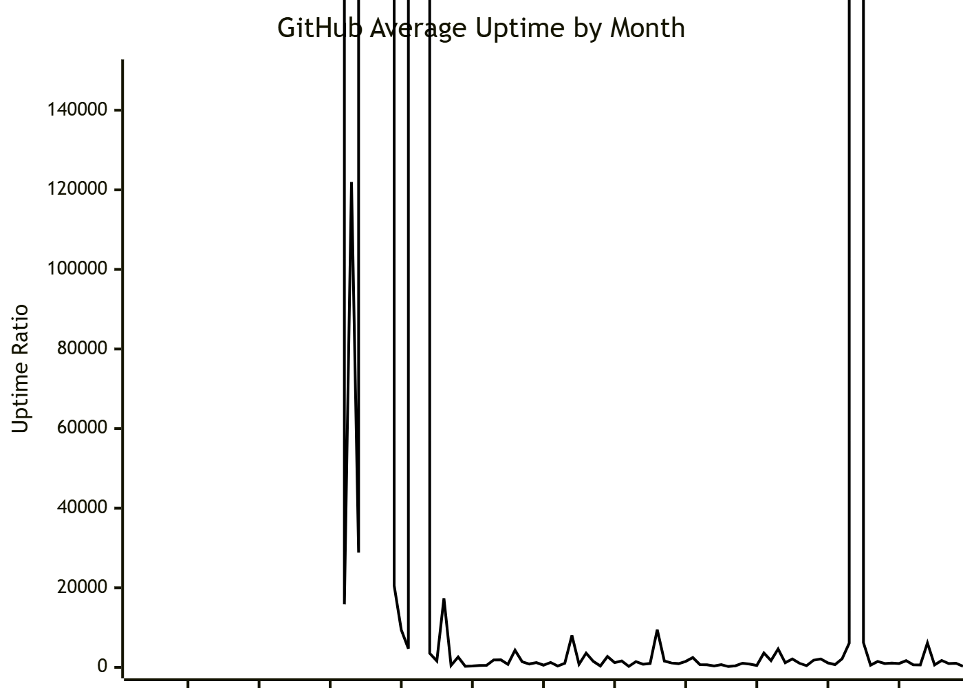
We could massage the data further by changing the units of the ratio from 1:1 to something else. Different scales might make sense for different levels of availability, such as months per minute (1/43200), or days per second (1/86400).
We can then also choose an arbitrarily large value as our maximum value as a stand-in for infinity. In the following example, which uses a months per minute adjustment, the maximum value used is 30, which implies that those months may have up to two seconds of downtime
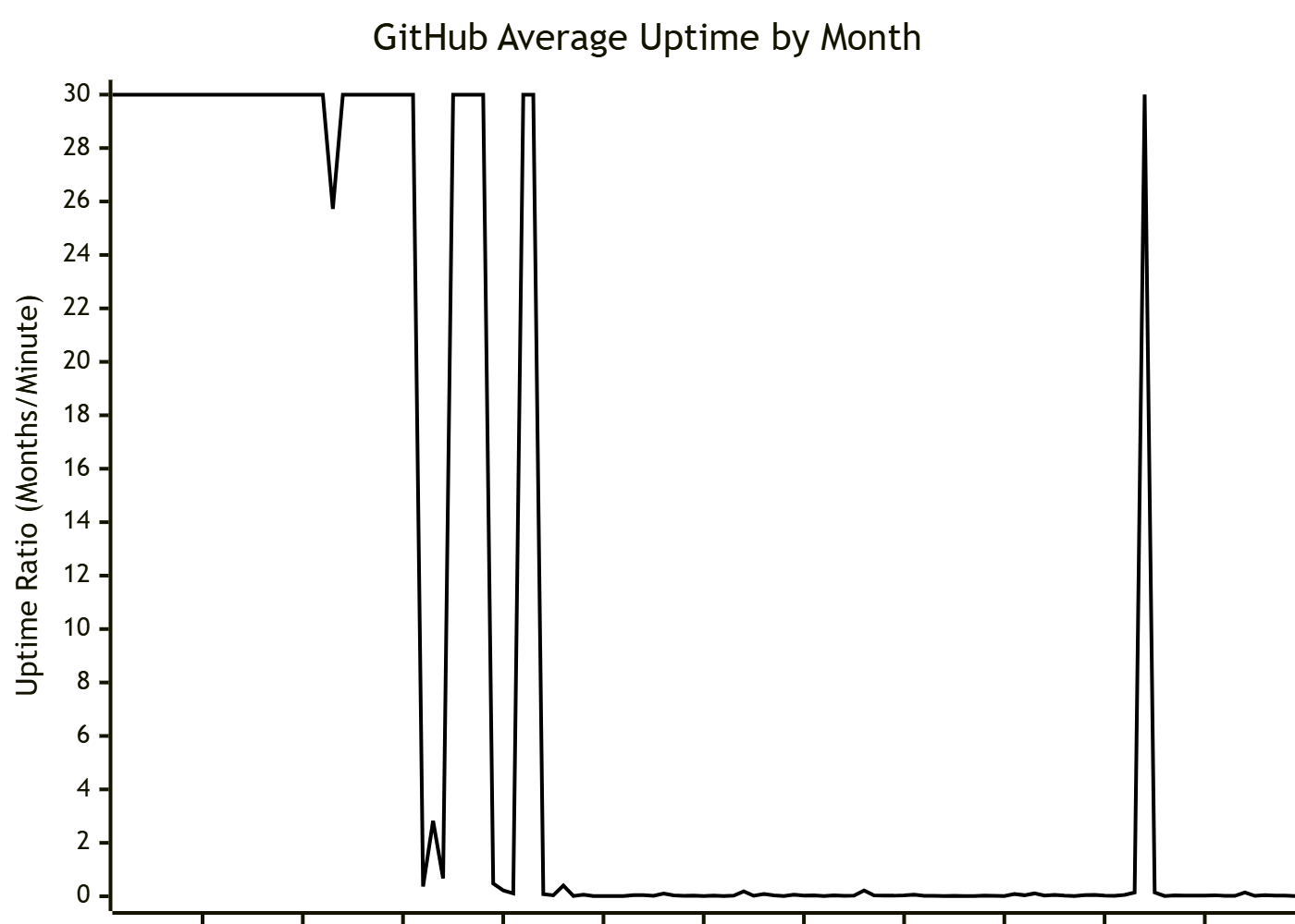
Even with data massaging the asymptotic nature of values representing 100% uptime make this visualization less than ideal. Some improvements might be had by switching to a logarithmic plot, but ultimately I think we can do better.
What if, instead of Uptime Ratio we looked at Downtime Ratio?
Just like Uptime Ratio we can massage the equation to express Downtime Ratio as a function of Uptime%:
Like Uptime%, and Uptime Ratio before it, Downtime Ratio is a unitless value, and represents the average of how many units of time a service is down for every unit of time the service is up.
And, just like Uptime Ratio, we can scale the values by different units in order to produce a meaningful visualization.
| Nines | Uptime | Downtime Ratio |
|---|---|---|
| 2 | 99% | 7h16m/month |
| 3 | 99.9% | 43m/month |
| 4 | 99.99% | 4m19s/month |
| 5 | 99.999% | 26s/month |
The benefit to Downtime Ratio is that 100% uptime becomes 0% downtime. 100% downtime does turn into Infinity, but anyone experiencing 100% downtime has more important things to worry about than how they're reporting their data.
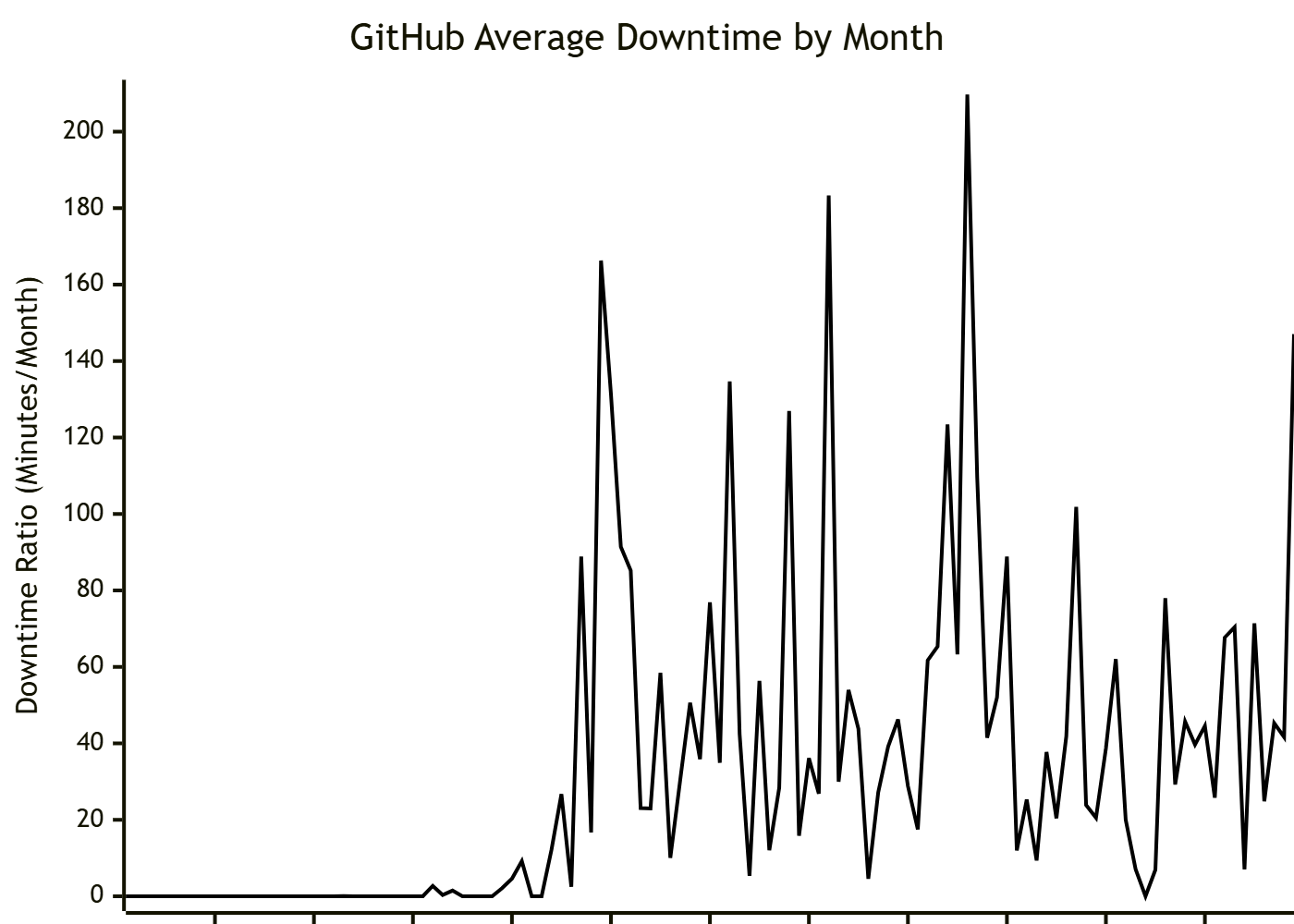
This is how I'd prefer to talk about uptime.
It's not significantly different than just plotting the actual number of minutes of downtime each month (or seconds each day) but by using the ratio, downtime is weighted heavier the longer it lasts.
You can go further by inverting the range on the graph, since the Downtime Ratio represents a negative effect on the system.
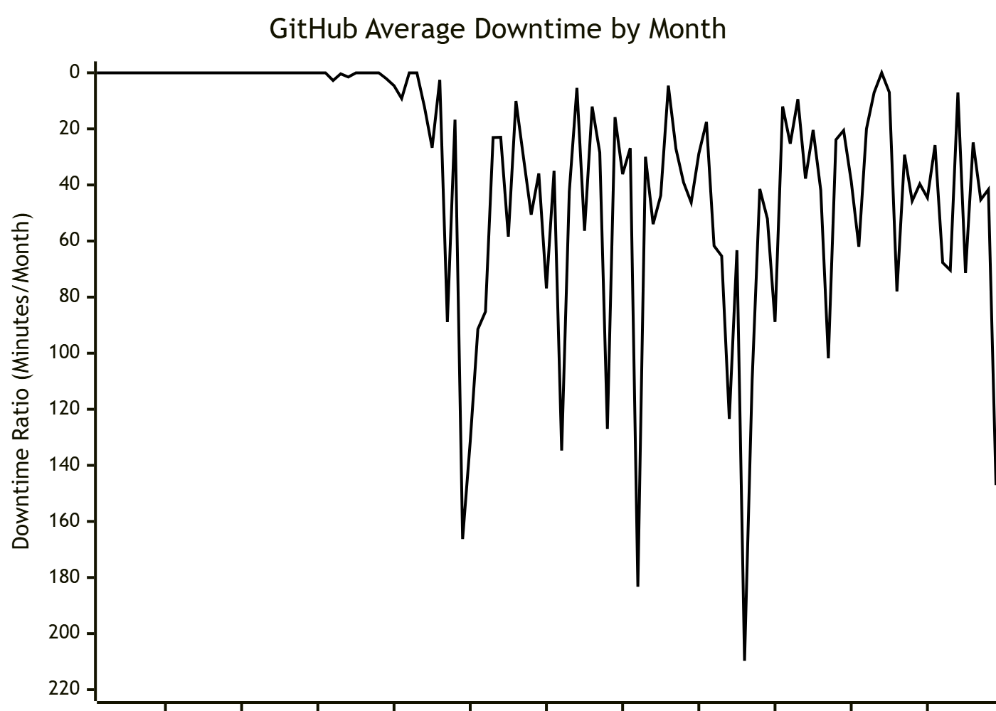
And suddenly all that math and data massaging has led us right back to where we began, with the same basic graph, telling the same story, except this version has better units to provide understandable context to the reader.